

You might have heard of colour psychology, but have you read about the seasons when it comes to branding and design?
Colour psychology can provide you with a framework to select elements for your website. It ties together colours, type, patterns, photography and illustration to make a cohesive design.
It's about bringing together the characteristics and personalities of the four seasons: Spring, Summer, Autumn and Winter. Each season feels very different which can be reflected in your website and brand. How do you want people to feel when they visit your site? What do you want them to know about you/your brand?
Let me take you through the four seasons and what elements suit each.
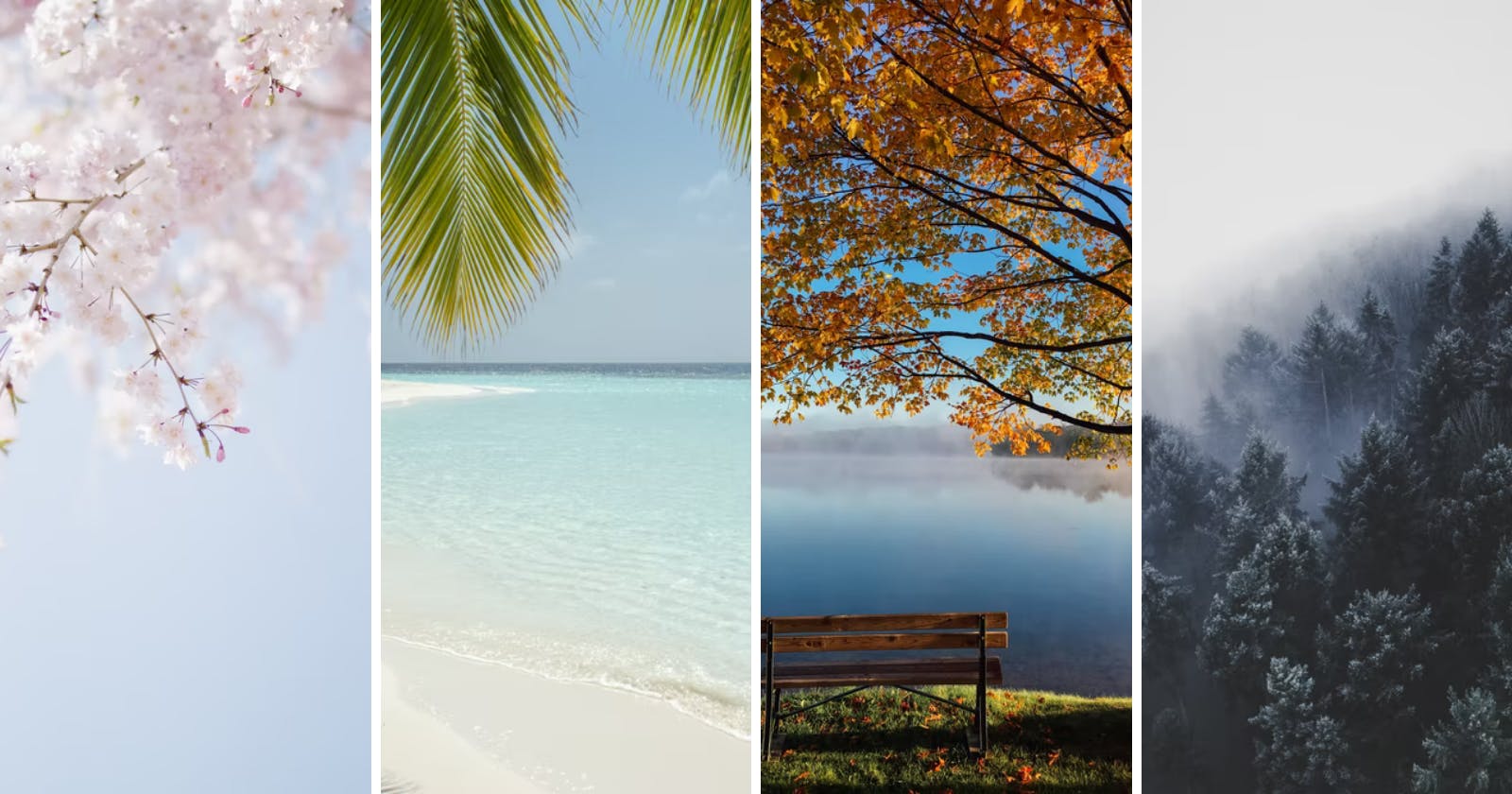
Spring
light, bright, clear, warm
- bubbly
- creative
- friendly
- fun
- imaginative
- inspirational
Spring is all about the fresh start, spring in your step and have some fun. Colours will be warm, light and bright for the season. The best type for Spring will be light and fuss-free, maybe have a curve or handwriting. Ditsy, playful patterns and light, clear photography will work well.
Summer
light, delicate, cool
- elegant
- artistic
- dependable
- supportive
- traditional
- eye for detail
Summer will have soft, muted, cool-toned colours. Flowing lines work well and photography could be airy and soft. Elegant and timeless type are ideal, especially matching a floaty handwriting font with a traditional serif type.
Autumn
warm, intense, muted
- passionate
- ethical
- efficient
- ambitious
- authentic
- practical
Colours for autumn will be warm and intense like the changing leaves. Types that have a texture would work well as well as patterns that have an earthy, natural vibe - think craft paper, burlap or wood bark.
Winter
cool, strong, intense, clear
- dramatic
- elegant
- expensive
- market-leader
- strong
- expert
Black is a solid winter colour, it's not used in the other seasons as it's so harsh. It feels strong and luxurious when used alongside other winter elements. Other colours are bright, clear and cool. Geometric shapes and lines work well.
What season is your website?
Your brand personality isn't your personality. It can have elements of you in it, especially if it's a personal brand. But it's how you want your customers/clients/following to feel. For example, if you offer high-end luxury websites, you might not want to show off how bubbly and fun your brand is with spring elements.
What season do you think your website/brand fits in personality-wise? Do the colours and type etc fit into that season?
Let's Connect!
✨ Github